Friday, July 28, 2017

News and Trust

There's a survey report out today about news trust and credibility, and there's a better look at the results here, if you're so inclined. It's a weird study, in a way. Here's why:
Data were collected in the February and March 2017 using an online survey made available to users (N = 8,728) of the digital media platforms of twenty-eight different newsrooms across the United States.
In other words, it's a SLOP. A really big SLOP, with some statistical weighting done to correct for different sized news organizations that participated, but a SLOP nonetheless. Participants came from the websites of news orgs, so you can't really generalize it to the population as a whole, just those who happened to visit those news sites and who happened to feel like participating in an online survey.

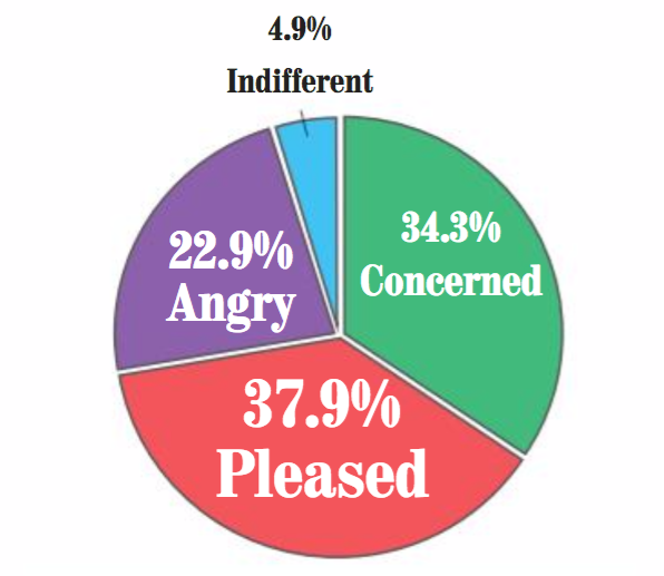
That said, there's some good information here and it's worth your time. At least some. This graphic is interesting, though I suspect due to the sample, a bit flawed. You can see it and others on the report itself.


So what makes a news source credible? The survey had an open-ended question that allowed up to three words as a response (seen at the end of the report). Here are the top five.

  1. other news sources
  2. both sides issue
  3. both sides story
  4. check multiple sources
  5. present both sides
It doesn't take a social scientist to figure out what's going on above. Presenting more than one side of a story is directly tied to perceptions of credibility. Of course this is exactly what talk radio and certain cable television talking heads never do, or if they do it, it's a straw man argument for the other side that's easy for them to knock down. Rarely will you hear a talk radio host provide a fair representation of the other side's position. By the way, the list continues with lots of references to checking multiple sources and similar answers.

Keep in mind these are the responses of people who visit legitimate news sites, not the general public or even the general news consuming public. It's a big, but biased, sample. That said, there's something you can glean from a quick read.


Wednesday, July 26, 2017

Who Won the Popular Prez Vote?

As most folks know, Donald Trump won the 2016 Electoral College but Hillary Clinton won the popular vote by nearly 2.9 million. Turns out, Trump fans believe he won the 2016 popular vote. He didn't, but let's forget the facts.

In that poll linked above, here are the poll's topline results and here are the more interesting crosstabs. Let's focus on the latter. By the way, if you're searching for the question, it's POL18.

The question asked: Based on what you know, who received the most votes from the general population in the 2016 presidential election?

Overall, 28 percent of respondents said incorrectly that Trump won the popular vote and among Trump voters, 49 percent incorrectly said he received more votes. Men and women were about equally incorrect on this question. As you'd expect, education plays a role. Among the lowest education group, 31 percent said Trump won while in the highest education group, 21 percent said he received the most popular votes.

Tuesday, July 25, 2017

Blogiversary

I let the 10th anniversary of this blog slip by. The very first post was May 2, 2007, and aptly named "Yet Another Blog." Long live the blog. This space has changed over time. At first it was me writing about media research, then it started to include media in general, then it included major stories and data journalism, then it turned into pretty much whatever the hell I felt like writing at the time.

Over the years I've had serious traffic, but most days I have tens of readers worldwide. Below is a quick look at the traffic over time, the bottom showing the most popular blog posts, which happen to involve the infamous editor walkout at The Red & Black, UGA's student newspaper (links below).


For those unaware of that walkout, that generated national coverage, here are links in chronological order to my posts. Read them in that order and it'll make more sense. Those students, by the way, are out there still doing great stuff professionally.

First post
Second post
Third post

You can see in the graphic above how readership jumped during that period, then the blog levels off with some spikes here and there, depending on individual stories, often with data, usually with some local angle.

Most of the traffic here comes from Google, often people searching for research terms that often come up in my posts, like above's "cognitive mobilization," which is a popular research topic, especially in Europe, and one I did some stuff on as a grad student. A lot of folks also end up here via Twitter, mainly from me tweeting about my most recent post with a link, or it being shared. Third place goes to Facebook as I sometimes, but not often, will post what I'm writing there with a link back.

Monday, July 24, 2017

"Roughing Up" and Violence

Remember the Donald Trump campaign and protesters getting pushed around? There's still a lawsuit pending on that incident, so it got me to wondering what people think about such actions.

Welcome to another round of Hollander Plays With Data.

The 2016 ANES has a couple of questions that kinda get to this issue. They ask:
When protestors [sic] get "roughed up" for disrupting political events, how much do they generally deserve what happens to them? Responses ranged from "not at all" to "a great deal" on a 5-point scale. 
How much do you feel it is justified for people to use violence to pursue their political goals in this country? Responses ranged from "not at all" to "a great deal" on a 5-point scale.
The first question clearly is aimed at Trump rallies and protesters, the second more a case of protesters using violence and seems, to me, more aimed at Democrats.

First off, there's a modest but statistically significant correlation between the two (r = .16, p<.001). That's not particularly strong. You see much stronger correlations with party identification and ideology. The more you leaned Republican, the more you liked roughing up protesters (r = .30, p<.001) but didn't like violence for political goals (r = -.06, p<.01). Or we can flip this and argue that the more you leaned Democrat, the less you liked roughing up folks but the more you agreed violence was sometimes necessary for political goals. that last one is pretty small, a correlation coefficient of .06. If not for the large N (3,572 respondents) it probably wouldn't even be statistically significant, so let's stick to the "roughing up" issue.

There's a lot to untangle here. It's no surprise that survey respondents who preferred Trump also tended to agree that sometimes you needed tough love with protesters (X2 = 420.0, df = 4, p<.001). To sum it up, for example, among those who strongly agreed that protesters got what they deserved, 75.5 percent supported Trump, 24.5 percent supported Clinton. The raw number of responses are seen below by Clinton/Trump support pre-election. It's hardly surprising that the red bars are longer at the agreement level, the blue bars are longer at the "not at all" end of the spectrum. In other words, it's all partisanship.


For fun I ran a quick-and-dirty multiple regression on the "roughed up" variable to see what factors are really driving this. Simply put, a regression puts all the factors into a model to compete with one another, with those that best explain the concept winning out and rising to statistical significance.

Some stuff does not play a role, when controlling for other factors. Age, sex, race, reading newspapers, watching television, news, or listening to radio for news are not factors. What is a factor? Less education and lower income are related to believing in roughing 'em up, which of course is a function of Trump's political support. Party ID and ideology are both factors in the expected direction. Using the internet for news is a negative predictor, so the more you use the net for news, the less you believe in roughing 'em up. Finally, for fun, watching Bill O'Reilly, even after controlling for all this other stuff, still means you think the protesters get what they deserve (beta = .06, p<.01 for you stats nerds out there). Fox News is always a special case.

Honestly, this may be worth a paper, if I can find time to really get into it.


Wednesday, July 19, 2017

An Odd Survey

So killing time on the UGA campus, I saw this flier.


So I checked it out. You can too by going here. There's no mention on the flier or on the survey itself who is sponsoring this thing, what's it going to be used for, or anything at all, at least not at the beginning. So I did the survey despite not being a student.

First off, you get a set of "I believe ..." statements and you see a Likert-type response ranging from strongly disagree to strongly agree. Here are some examples of statements:

  • I believe that it is important to talk to others about societal systems of power, privilege, and oppression
  • I believe that it is important to help individuals and groups to pursue their chosen goals in life

That's just from the first page, but you get the idea. Page two gets a little stranger, asking how relevant to your thinking. By page three we return to statements for agreement or disagreement, such as this one:

It is better to do good than to do bad.

And after that we get into classroom stuff, which is fascinating, especially as it asks how you'd consider a professor criticizing you on opinions about gender, sexuality, etc.  It's a rather long page of statements. Near the end we get the standard demographic questions, such as age or major.

Given the UGA logo, I can only assume this survey was sponsored or conducted by a UGA office, but it's hard to tell. The sponsor should be listed. It's not even clear if this survey went through human subjects approval, as their no information about that, or an informed consent.

Very odd.


Monday, July 17, 2017

The Expectations Game

I'm always fascinated not so much by who people say they're going to vote for as who they think is going to win. Generally, people say their preferred candidate will win and you can see that below. I'm playing with some 2016 election data. Of those who said in the pre-election survey they preferred Clinton, 96.2 percent predicted she would win. Of those in the pre-election survey who preferred Trump, 75.6 percent predicted he would win. For you statistical nerds out there, that's a X2 of 1399.7, p<.001. In other words, a huge association. See the table below for a summary.


Who Will Win


Clinton
Trump
TOTAL
Who Voting For


     Clinton
1333
  52
1385
     Trump
  279
865
1144
TOTAL
1612
917
2528

I excluded the handfuls of people who preferred or said they would vote for Gary Johnson and Jill Stein. Their numbers are too small to matter, at least when comparing the preference-expectation link. 

We call the above findings wishful thinking, a body of research that consistently demonstrates that people tend to believe their sports team or candidate will win, even when that candidate or team is behind. 

When time allows I'll look at the predictors of wishful thinking in the 2016 election. Who were the 52 Clinton supporters who predicted Trump would win? How do they differ, if at all, from the 1,333 who said Clinton would win? And vice versa for Trump. We do know that affect, as in emotion, plays a huge role. The more you care about an outcome, the more likely you are to engage in wishful thinking. Education and knowledge tend to, at least somewhat, make people more accurate. The role of the media is kinda mixed. In my analysis of 2012 data, I found that watching partisan news, such as Fox News, made you more likely to inaccurately predict Mitt Romney would win, even after controlling for lots of other factors such as caring about the outcome. It'll be fun to see if watching MSNBC, for example, has the same effect on Clinton supporters in 2016 that Fox had on Romney supporters in 2012.

Wait. I do have one quick analysis to share. The only MSNBC program in the data, that of Chris Matthews (Hardball), there seems to be an effect. Among those who watch Hardball and supported Clinton, not a single one predicted Trump would win. For those who didn't watch Hardball and supported Clinton, 4.1 percent predicted Trump would win. That's not a powerful effect, but it is suggestive. There's a similar result for watching CNN's Anderson Cooper, but not quite as strong.

Again, when I have time I'll build a multivariate model and see what separates the accurate from the inaccurate.

A final word. The overall expectation in the numbers above was that Clinton would win -- and she did -- at least in terms of the raw popular vote, and that's what this poll reflects. Most respondents are not doing a state-by-state Electoral College analysis in their heads when answering a survey question like this. The same happened in 2000 when George W. Bush lost the popular vote to Al Gore but won the Electoral College. The ANES data that year had more folks expecting a Gore win. And he did, in terms of the popular vote. A more nuanced analysis here would include the state the respondents live in and whether they were accurate predicting their state versus the national outcome. Yes, I have those data.

---
Data source: ANES 2016 survey

Thursday, July 13, 2017

Online Polls

I've been slow to get to this, other than a Twitterspat on the topic of polls. The Red & Black ran an online poll about campus carry. The results are below.


I'm a well-established of online polls and I don't want to repeat my disgust with SLOPs any more. I'm tired of doing it, tired of no one listening. Let's face it, I'm pooped. So it's a crap sample of a few hundred people who happened to stumble across the web page and felt the urge to click a button and vote. By the way, the results are slightly different now as the poll is still up, so feel free to vote yourself. I voted indifferent because, dammit, I always pull for the underdog.

Other than a lousy sample, I'm also not too sure about the metric here, what we in the public opinion biz call the response alternatives. In other words, the answers allowed. There are four, two of them negative, one of them positive, one of them, well, indifferent. Does this make sense? Not as presented. Angry could be angry about passage, angry about the restrictions on carrying a concealed weapon (no faculty offices, no dorms, etc.). So we can't say its a continuum from Pleased through Concerned to Angry, not in the way the results are presented. I might have labeled two answers for each positive or negative, or some such. One way to interpret these results is 57.2 percent don't like it (angry or concerned) and just over a third (37.9 percent) are okay with it. Another way to interpret it is more people are pleased than they are angry or concerned. Feel free to spin it any way you want, because the sample itself makes the results unimportant.

Given this is kinda old now, I'm not even gonna tweet a link here. I pick on the R&B enough, as is.

I Promise, Nearly Done

And now the fourth post on UGA parking ticket data. Yes, you're sick of reading about it, but I'm not sick (yet) of writing about it. In previous posts I've looked at how many tickets were written in the 2016-2017 academic year, what lots were more likely to have tickets written, and even what color car is most likely to get a ticket.

Today, what charge is most likely to occur.

On my list there are 25 possible reasons a ticket may be written, plus a 26th that is blank with three tickets written for that, probably a data mispunch or perhaps some special case or, most likely, they forgot to put the charge in the database while writing the ticket. Anyway, below you'll find a rank order of the various charges and the count. Dominating the list is "no parking permit," with 15,184 of the total 27,439 tickets written that year, or 55.5 percent if you like it broken down that way. In other words, over half of all tickets are given to cars that didn't bother to get a parking permit in the first place. Second on the list is "out of zone/region" which means, best I can tell, folks who had a permit for one lot but decided they could park in a different lot just because they're special. Some of the charges I'm unsure about, like "theft of parking services."  Also, who the hell parks in a fire lane? Turns out, 37 such tickets were written. And who the hell, especially, parks in a handicapped zone? Scum, I'd say, but 127 tickets were written for "disability space" and 53 for "disability access zone."

Below the list, I have a few words about some of the charges after the table.

Ticket Charge

Count
No Parking Permit

15184
Out of Zone\Region

7594
Courtesy Note - Vehicle Linked

931
Unauthorized Area

905
Patient Parking

761
Failure to display

535
Yellow Zone

248
Sidewalk\Grass

179
Football Parking

153
No Permit Displayed

141
Disability Space

127
Improper Parking

125
Theft of Parking Services

120
DP with No Valid UGA Permit

112
Expired Permit

72
Beyond Time Limit

67
Disability Access Zone

53
No Meter Receipt Displayed

38
Fire Lane

37
No Overnight Parking

29
Improperly Displayed Receipt

8
Multiple Vehicles Parked

7
Alter/Falsify Permit

6
No Charge Entered

3
Obstructing Traffic

3
Expired Meter

1
Grand Total

27439


There were 133 "football parking" tickets written. Most of these were on the various campus decks and, no surprise, on Football Saturdays in Athens, when campus gets crowded and the port-a-lets come out to play. More seem to come from the South Campus Deck than any other lot.


f

UGA Parking Tix -- It's all Black and White

In playing with the 2016-2017 academic year parking ticket data on the University of Georgia campus, I decided to look at the car color and number of tickets given. Because, of course, those red cars get more tickets, right? Nope. It's all black and white. Below is the ranking by color of cars given tickets last academic year.
  1. Black (6,118 tix)
  2. White (5,217 tix)
  3. Silver (4.594 tix)
  4. Blue (2,472 tix)
  5. Gold (628 tix)
I could go on and on with the rankings but why bother. This analysis is a perfect case study in how not to interpret the data. Sure, black cars get more tickets at UGA, about 23 percent of all written that year, but this is important -- we do not know the proportion of black cars out there compared to other colors, so we cannot say black cars are treated fairly, unfairly, or it's just plain coincidence. White, black, grey and silver cars make up an estimated 70 percent of all autos, according to one site I looked at, so making a big deal out of car color here would be a big mistake.

In much the same way, it's silly to note that Toyota brand cars get the most tickets, followed by Honda, Ford, and Nissan. There are simply more of those on the road or on campus, so you'd expect to get more tickets for those vehicles. If you're curious, silver Toyota got the most tickets of any brand/color combination (901 tickets). 

Oh, and a Ferrari got one ticket last year. Good. Thirty-five tickets were written for Hummers. Even better. BMWs got 813 tickets. Best of all, because no one likes people who drive BMWs. 

In the odd category, there was a car designated as "American Motors" that got one ticket. No idea what kind of car it was, a Pacer or what. Don't see much of those around any more.

On another day I'll look at how often people park in handicapped spaces, which is one of my pet peeves. Look at my previous posts for other breakdowns, first post here, second post here.

Tuesday, July 11, 2017

University Athletic Numbers

Thanks to this AJC story that pointed me to USA Today data on the revenues and expenses from university athletic departments. I dumped the data and created my own database to play around some. My first question was, how many schools have greater expenses than revenues? Let's take a look.

Proving it helps to spend money to make money, I suppose, there's a high correlation between expense and revenue. In fact, an almost perfect correlation (r = .99 for you statistical nerds out there). That's outrageously high. Anyway, below is the list of top ten in terms of revenue. In parentheses is their expenses ranking.

  1. Texas A&M (5)
  2. Texas (1)
  3. Ohio State (2)
  4. Alabama (4)
  5. Michigan (3)
  6. Oklahoma (9)
  7. LSU (12)
  8. Florida (14)
  9. Tennessee (8)
  10. Auburn (11)
Oh, by the way, Georgia is ranked 15th in revenue and 16th in expenses. 

As you can see above, the big spenders are also the big moneymakers, which is hardly surprising. Wisconsin and Penn State probably underperform, ranking 7th and 8th respectively in terms of expenses but only 11th and 12th, respectively, in terms of revenues. But still, a million dollars here, a million dollars there, what's the difference?

Texas A&M ranks #1 too on making more than it spends (revenue - expense), followed by Oklahoma, Florida, Arkansas, and West Virginia. Schools doing it backwards, more expenses than revenues? California had $21.7 million more in expenses than revenue, far more than #2 Washington State at $12.9 million (both PAC-12 schools, kinda interesting).

If you look at the original data on USA Today you'll see a "total allocated" column, which includes student fees and other monies transferred into the athletics program. You tend to see the highest numbers among mid-majors. James Madison has the most ($38.1 million), followed by Connecticut ($35.3 million). 

Finally, how do the conferences stack up? About as you'd expect. 

Revenue (rank in Expenses in parentheses)
  1. SEC (1)
  2. Big Ten (2)
  3. Pac-12 (3)
  4. Big 12 (4)
  5. ACC (5)
In other words, spend money, make money. Now the results above are based on the sum of all teams in a conference. If we change that to a conference's average the results are similar, the SEC and Big Ten lead, a shuffling below but the same conferences. In other words, how we do the math doesn't matter all that much.


Comparing Years for UGA Parking Tix

I wrote yesterday about parking ticket data. Let's compare 2015-16 academic year with the 2016-17 academic year on the most popular lots to see parking tickets. Why? Because it's my blog. I can do what I want.

Rank
2015-16
2016-17
1
Legion Pool
Legion Pool
2
Ramsey Center
Ramsey Center
3
E. River Road
Carlton St.
4
Ramsey Lower
West Campus Deck
5
North River Road
E. River Road
6
Driftmier Eng
Railroad Lot
7
Academic Achievement
Health Sciences
8
Carlton St.
W. Coliseum
9
Life Sciences Upper
Kappa Alpha
10
Health Sciences
North Hull

As you can see, the top two lots remain the same, but after that we get into something of a random shuffle that's probably not random at all but more due to construction near those lots or other factors I'm not aware of. Take West Campus Deck, for example. In the 2015-16 data it's way down the list, ranked 100th. Why, I don't know, but probably some student can tell me what caused this. The Railroad Lot is also high in 16-17 but it's 11th in 15-16, just off our Top Ten list, so no biggie. West Coliseum is high in 16-17 but was 24th in the previous year, perhaps due to construction around the nearby new science learning center.

So all in all, the lot lists are relatively consistent. They're the most popular and larger lots, hence they attract more illegal parking, and thus more tickets. For fun I dug back into my 2010-11 academic year data and, yes, the lots look more or less the same. Keep in mind some lots didn't exist back then or their names have changed or they're completely gone due to construction. Here's the Top Ten from 2010-2011:
  1. Ramsey Center
  2. Ramsey Lower
  3. Chi Psi House
  4. Carlton St.
  5. North River Road
  6. Rutherford Hall
  7. Railroad/Training
  8. Psychology Clinic
  9. Baxter Lumpkin
  10. E. River Road
Ramsey is always popular, and therefore draws students (and sometimes faculty and staff) with creative parking skills. The Psychology Clinic gets a lot of tickets for relatively few parking spaces, most of which are never used by patients but operate as a nice mousetrap for student parkers.


Monday, July 10, 2017

Parking Tickets, UGA Style

It's time for my annual requests of various data from UGA, this one the ever-popular parking ticket data for Academic Year 2016-2017 (beginning and end of classes).

Here's a first blush with the data. I have other stuff going on, so will dig more another time.

There were 27,439 tickets written last academic year. On another post I'll compare this to previous years but it seems a bit more. The top lots? Below are the Top Five with the actual number of tix written in parentheses):

  1. Legion Pool (1800)
  2. Ramsey Center Lot (1396) 
  3. Carlton Street (1193)
  4. West Campus Deck (887)
  5. East River Road Area (690)
Again, on another day I'll do some comparisons to previous years, but I vaguely recall Legion being #1 last year, the first time a Ramsey lot had not led in the years I've been doing this. I thought Legion jumped to the top in 15-16 academic year because of construction around Bolton, but I'm not sure that explains this year.

By the way, most of those Legion pool lots were written in the afternoon/evening but more Ramsey tix were written in the morning, before noon. On another day I'll break this down finer, hour by hour. I'm kinda rushed at the moment.

Okay, day of the week is always interesting. More tickets were written on Wednesdays than any other days. Below I break it down for you, by percentages:
  • Sunday (0%)
  • Monday (20.8%)
  • Tuesday (21.7%)
  • Wednesday (23.1%)
  • Thursday (18.0%)
  • Friday (15.9%)
  • Saturday (0.6%)
I can break this down a million ways and probably will when time allows. Just so you know, Tuesdays and Wednesdays are the busiest at Legion Pool for tickets, but Monday is the busiest at Ramsey Center Lot., but not by much. Friday is the busiest day at Health Sciences. Go figure.

There are 231 lots listed. Of these, 18 had only 1 ticket written. There may be other lots where no tix were written and don't show up in my data, but I have elsewhere a list of every friggin lot on campus and how many spaces are in that lot. I suspect it's out of date, but I use it to compare pound-for-pound what lots get more tickets than you'd expect, given their size. The usual winner of this is the Psychology lot outside my office, the patient parking one, where people are apparently unable to read the large signs that say Don't Park Here. Patient Parking. Never mind there are far too many spaces set aside for the one or two patients who swing through the psychology clinic.

UPDATE

Here's the total list by lot and # of tix.

LEGION POOL
1800
RAMSEY CENTER LOT
1396
CARLTON ST
1193
WEST CAMPUS DECK
887
E RIVER ROAD AREA
690
RAILROAD LOT
682
Health Sciences Campus
670
W. COLISEUM
665
Kappa Alpha
624
- North Hull
598
DRIFTMIER ENGINEERING
552
ACADEMIC ACHIEVEMENT CTR.
538
NORTH RIVER ROAD AREA
535
LIFE SCIENCES A (UPPER)
499
EAST VILLAGE DECK
477
ADERHOLD CLINIC
445
NO PARKING AREA
417
CHI PSI HOUSE
413
O'Malleys
408
MORRIS HALL
404
RUTHERFORD HALL
399
HARDMAN HALL
396
LIVESTOCK - POULTRY
384
RAMSEY / LOWER
383
REED HALL
378
PSYCHOLOGY CLINIC
377
BOGGS HALL
366
E. BOYD GRAD STUDIES
351
BOLTON HALL
341
EAST CAMPUS RD
331
GREEK PARK
305
UPPER RUSSELL
298
Vet Med Campus
271
NORTH PVAC B
269
SANFORD DR
253
VETERINARY MEDICINE
239
IM Deck
223
BARROW ANNEX
216
TRIANGLE LOT
214
INTRAMURAL FIELDS
211
NORTH PVAC C
202
LOWER FORESTRY
189
MAIN LIBRARY
183
THOMAS - OCONEE ST
178
MCWHORTER HALL REAR UPPER
169
ANIMAL SCIENCES SW
166
MCWHORTER HALL REAR LOWER
166
RIVER'S CROSSING
149
OLD PHYSICAL PLANT
149
HOOPER ST
146
ROGERS RD (P-S)
142
AG TECH/ HORTICULTURE
142
BUSINESS SVCS ANNEX
134
Baldwin Hall Small
121
BRUMBY HALL-MAIN
119
Newton Street Paved
118
CHURCH ST LOTS
113
SOUTH CAMPUS DECK
111
MCWHORTER HALL (FRONT)
105
O'HOUSE DINING
101
FIELD STREET
99
ROGERS RD (M,N)
99
MIDDLE OCONEE ST
98
ANIMAL SCIENCES EAST
96
NORTH OF EV DECK
95
NORTH CAMPUS DECK
93
AUXILIARY SVCS
86
UPPER PHARMACY
86
UNIVERSITY VILLAGE (C)
84
Coverdell
83
HILL HALL
81
- Enviromental Design
79
UNIVERSITY VILLAGE (H)
79
GENERAL PARKING AREA
79
FINE ARTS MILITARY
76
LOWER OCONEE ST
76
OGLETHORPE HOUSE
75
FANNING INSTITUTE
75
LOWER CRESWELL
74
- Drawing & Painting Studio
72
PSYCHOLOGY
72
EAST DECK
72
BALDWIN HALL
71
1324 S. LUMPKIN
68
E. Cloverhurst & University
66
CHICOPEE BROAD
63
CRESWELL CIRCLE
62
FOOD PROCESSING
60
EVH LOADING ZONE
60
CLOVERHURST
59
THOMAS ST ART
58
CARLTON ST DECK
58
NEWTON STREET GRAVEL
57
PHYSICS
56
THORNTON BROTHERS
55
UPPER CRESWELL
55
SANFORD CIRCLE
54
ADERHOLD HALL
50
BRUMBY HALL-LOWER
48
REED PIT
48
UNIVERSITY VILLAGE (A,B)
48
SPRING ST
47
HOME MGMT. CIRCLE
47
CONNER HALL
46
HEALTH CENTER PATIENT
46
N. HERTY CANDLER
45
BRUMBY CIRCLE
45
MCPHAUL PARENT
43
VISITORS CENTER
42
SNELLING REAR
42
Dean Rusk
41
CHICOPEE FIRST ST
39
COOPERATIVE EXTENSION
37
WRAY-NICHOLSON
36
Visitor Parking
35
Student Worker Lot
35
FOOD SCIENCES
34
Dooley Plaza
34
BRANDON OAKS
33
CHURCH HALL
33
UNIVERSITY VILLAGE (E)
33
FOUR TOWERS
30
TATE CENTER LOT
30
HULL STREET DECK
30
FAMILY HOUSING OFFICE
29
UNIVERSITY VILLAGE (K)
29
UNIVERSITY VILLAGE (G)
28
LIFE SCIENCES C (LOWER)
26
Greenhouses
25
RIVERBEND REASEARCH LABS
23
DELTA CHI (N. END)
23
TENNIS COURT
23
LOWER BROOKS
23
UNIVERSITY VILLAGE (J)
23
CHICOPEE UTILITIES
23
HOKE SMITH ANNEX
22
CLARKE HOWELL
18
HODSON OIL
17
RUTHERFORD ST
17
UNIVERSITY VILLAGE (D)
16
N. BOYD GRAD
16
UNIVERSITY VILLAGE (L)
14
Ceramics
13
CCRC Wooded Lot
13
CREAMERY (ENVIP HEALTH)
13
TATE PAY LOT
12
HEALTH CENTER
12
DAWSON HALL
11
CHICOPEE HERMAN ST
11
HUMAN RESOURCES
11
LUCY COBB INST.
10
TUCKER HALL
10
INT. DESIGN STUDIOS
9
CCRC
9
PAC DECK
7
CHEMISTRY STOCKROOM
7
PLANT SCIENCES SV
6
Botany
5
MC/SC Parking
5
RUSSELL HALL SV
5
REAR CRESWELL SV
4
HEALTH CENTER ANNEX
4
VET SMALL ANIMAL CLINIC
4
TRAINING AND DEVELOPMENT
4
GILBERT HALL
4
LOWER PHARMACY
4
OFFICE MACHINE MAINT.
4
HUNTER - HOLMES
3
CHEMISTRY
3
BAXTER LUMPKIN
3
CENTRAL FOOD STORAGE
3
#VALUE!
3
SOUTH OF EV DECK
2
SMITH ST SV
2
BUTTS-MEHRE
2
ECOLOGY
2
MELL HALL
2
JOURNALISM SV
2
Carlton Street
1
HEALTH CENTER LOADING
1
ADMIN BUILDING
1
CAMPUS MAIL/ ENV. SAFETY
1
FORESTRY -REAR
1
GMOA
1
GA CENTER - REAR
1
OFFICE GOV. RELATIONS
1
PAINTING STUDIOS
1
LIPSCOMB HALL
1
CHICOPEE VINE ST
1
Grand Total
27439