Friday, July 29, 2016

About That UGA Climate Survey

Last year UGA did a "climate" survey. Not climate as in weather, as in warming, but climate as in diversity and that sort of thing. I wrote about it a few days ago, based on this Athens Banner-Herald story. Now I can provide you the link to the actual study, which the ABH story did not do for some reason, and discuss it in some small detail.

First, here is the link to the study page. You can read the full report (all 447 pages of it), a summary, or look at specific parts. Enjoy.

Back to my points. First, I requested from UGA a copy of the report and it provided me with the link, which is terrific. I also asked for a copy of the actual data. That request was denied because the data is part of ongoing research. Here's the open records line quoted to me. My discussion follows, but I boldface the part I find of interest.
This specific exemption applicable to those records is O.C.G.A. § 50-18-72 (a)(36). That exemption applies to: Any data, records, or information developed, collected, or received by or on behalf of faculty, staff, employees, or students of an institution of higher education or any public or private entity supporting or participating in the activities of an institution of higher education in the conduct of, or as a result of, study or research on medical, scientific, technical, scholarly, or artistic issues, whether sponsored by the institution alone or in conjunction with a governmental body or private entity, until such information is published, patented, otherwise publicly disseminated, or released to an agency whereupon the request must be made to the agency. This paragraph shall apply to, but shall not be limited to, information provided by participants in research, research notes and data, discoveries, research projects, methodologies, protocols, and creative works.
By providing me a link to a published study and summary, isn't that published? My read of the open records law says, by publishing the full study, the data is now available. I've asked for a clarification on exactly that point, but I'm hardly in the mood to fight it out in court or anything like that. The stakes are too low.

Back to the report itself. I don't care so much for the results except how the methodology skewed them. See my earlier post linked above, but basically this is a self-selected survey, meaning anyone could participate, and it turns out that of the potential respondents among students, staff, faculty, and administrators, one-third of the same are admins and staff. That's so off as to make the results questionable.

So why not a professional job with a random sample? Here's the answer:
The goal of the survey was to hear as many voices as possible. Rankin and Associates Consulting recommended not using random sampling because that methodology may inadvertently exclude populations where numbers are very small (e.g., Native American faculty). The survey was open to all faculty, staff and students to include the broadest array of perspectives possible.
First, the goal of research is to provide a useful, a generalizable answer. This fails. That said, they've done the same thing at other places, such as this Dartmouth study. According to Rankin & Associates, the consulting firm, for response rates less than 30 percent "caution is recommended when generalizing the results to the entire constituent group." The UGA study fell below that threshold, plus I'm unfamiliar with any magic assigned to the 30 percent response rate. It may be true, I've just never heard it before.

Second, oversampling certain populations is accepted practice, if done via random sampling.

When you have a SLOP (a self-selected survey), you get far more responses from people either very pissed about something or those who need the results to look good (i.e., admins and their staff). In other words, the results are deeply biased, deeply flawed.

On another day I want to break down the respondents. It's surprising. For example, 224 of the respondents work in the vice president of student affairs office, 84 for the VP of instruction, 44 of the respondents work in the provost's office, and so on ... including 19 from the office of the UGA president. Make of all this what you will.


Thursday, July 28, 2016

Campaign Finance

No one likes political advertising. Well, TV stations like it. And media buyers. But most of us could live without it or, at least, a lot less of it.

So how about this survey question:
Currently, groups not working with a political candidate may spend unlimited amounts of money on advertisements during a political campaign. Do you favor, oppose, or neither favor nor oppose placing limits on this kind of spending?
About a third of 1,200 respondents in a national survey said they favored this "a great deal." Nearly a third neither favored nor opposed it. A measly 9.4 percent opposed this "a great deal" and another 4.3 percent opposed it "moderately. In other words, the results are strongly skewed in one direction, that of limiting the money spend on ads during a political campaign. Click on the graphic below for a better look.


It's no surprise that there's a strong partisan division on this question and, hell, just about everything these days. Republicans were more likely to oppose it, Democrats were more likely to support it. Even so, let's look at those Republican responses. Among self-identified GOPers, most were more likely to fall in the "neither favor nor oppose" camp (37.1 percent). Only 12.1 percent of Republicans opposed it "a great deal." More fell the other way, with 16.6 percent of Republicans favoring it "a great deal" and another 14.3 percent favoring it "moderately." Let that sink in. Yes, the numbers are nowhere near the Democratic response to this question (for example, 41.2 percent of Dems favor it "a great deal"), but still it's kinda surprising.

I got curious about responses to this campaign finance reform question, so I dug deeper in the data. Warning, statistics ahead. I constructed a model that allows all the various factors to statistically control for one another and see which ones matter, which ones don't. I even created a variable based on whether respondents live in battleground states from 2012 and who may have been exposed to far more political ads than the rest of us.

Let's skip to the meat of the analysis. In my model were the usual socio-demographic variables, like age and income. It also included the state you lived (battleground or not), whether you voted in 2012 or expect to vote in 2016, whether you give money yourself to political campaigns, your political knowledge (based on three questions), how much you follow politics, and of course your party identification and ideology. The winners? Party ID and ideology, by far. For you nerds out there, the 13-variable model included few statistically significant results once Party ID and ideology stole all the variance. Party ID (high is Republican, beta = -.12, p<.001), and Ideology (high is conservative, beta = -.33, p<.001) explained most of the model. A few others emerge. Race (whites more likely to favor limits, beta = .39, p<.01), and an interest in politics (beta = .24, p<.01).

I thought for sure if you lived in a battleground state (Florida, Virginia, etc.) you'd be sick of ads and more likely to support limits. Nope. The regression coefficient is non-significant, even before we enter party ID and ideology. There's simply nuthin there. I was a bit surprised at the lack of a relationship with having voted, or expecting to vote. No idea why as to my surprise, but I kinda guessed voters may be a little more forgiving of political ads than those who don't vote and might prefer the whole election thing would simply go away.

Methodological Details

The "battleground" states based on political advertising spending in 2012 were: Colorado, Florida, Iowa, Nevada, New Hampshire, North Carolina, Ohio, Virginia, and Wisconsin. Spending in these states far outstripped that of others.

The survey and data are available here. Do your own analysis.

Final Model Results (beta weight in parentheses, * if statistically significant)

Age (-.03)
Race (.09*)
Sex (.05)
Income (.00)
Education (.05)
State (.02)
Voted 12 (-.03)
Will Vote 16 (.04)
Give $ (.00)
Party ID (-.13*)
Ideology (-.20*)
Political Knowledge (-.00)
Political Interest (.11*)


Wednesday, July 27, 2016

Will UGA Change Admission Policy?

Ever since a U.S. Supreme Court decision upholding the limited use of race in the University of Texas admission policy, I wondered if UGA may change its system.

Apparently not. Though it's hard to say. Maybe. Or not. This story just posted in my local paper suggests no changes are gonna happen. Here's the important, or actually unimportant, graph:
“The university’s current admission decision practices and procedures enroll an academically strong and diverse class and is working well as indicated by our first-year retention rate of 95 percent,” said Jan Gleason, UGA’s executive director for strategic marketing.
God save us from friggin flacks who say things without saying anything. Lemme guess, Jan Gleason. You wrote an email response. Lemme guess, ABH, you let her get away with an email response. Our "strategic marketing" person has managed to strategically say ... nothing. In fairness, maybe she said we have no plans to change anything and the ABH managed to leave that vital tidbit out of the story. All we get is it's "working well." If you read the story, you'll find no other support for the hed, which says:
UGA won't change admissions policies to allow race as a factor
I can only assume there's other stuff, not in the story, that supports this hed. It'd be nice to have it in the story.


Tuesday, July 26, 2016

107.77.235.84 Hates UGA

Meant to get around to this sooner but a talk I gave today reminded me of it. If you look at the "history" of edits on UGA's Wikipedia page you'll find weird edits by someone from IP 107.77.235.84. Here are a couple in which the UGA entry was changed to odd stuff, just brief lines.


You get the idea. If you look at the UGA history, you'll see the page has been "protected" a few times due to "persistent vandalism." The IP is via AT&T mobility out of Atlanta, but there's no way to know exactly where or who it is, that's just the carrier. This IP has made the two changes above, but one other time "blanked" the UGA page. In all cases it was caught, replaced, and locked for a time. It's open now.

Indeed, earlier strange edits to other pages ended with this warning:


Yes, stuff like this fascinates me. I suspect this happens to other schools as well, I just haven't taken the time to see.


Hillary Clinton, Lucifer, and Ohio

PPP loves throwing odd questions in its surveys. In an Ohio survey this week it asked:
Do you think Hillary Clinton has ties to Lucifer, or not? 
  • Clinton has ties to Lucifer 19%
  • Clinton does not have ties to Lucifer 63%
  • Not sure 18%
So nearly 1-out-of-5 have magically sensed her ties to Lucifer, and 18 percent just aren't sure. But if we view just Republicans (see below), a third of them are certain about her Lucifer-ness. Among Independents, 1-out-of-5 are convinced she's in league with the Prince of Darkness.


Democrats
Republicans
Independents
Clinton has
ties to
Lucifer

  6%

33%

20%
Clinton does
not have ties
to Lucifer

86%

43%

56%
Not sure
  8%
24%
24%

This is a good time to point out my favorite all-time quote about defining Public Opinion is from a play entitled, yes, Prince Lucifer.
Public opinion is no more than this,
what people think other people think.


Support for Campaign Finance Reform

Here's a survey question for you:
Currently, groups not working with a political candidate may spend unlimited amounts of money on advertisements during a political campaign. Do you favor, oppose, or neither favor nor oppose placing limits on this kind of spending?
This is from the 2016 ANES pilot study, a survey designed to test new questions for possible inclusion in the traditional ANES surveys conducted before and after each election. In our case, it allows us to see not only what people think about money in political campaigns (other surveys ask this kind of question too) but also to examine it in relation to other factors, from the obvious (party identification, ideology) to the less obvious.

First, let's look at the breakdown. There's a graphic below, but as you can see, in a national survey of 1,200 respondents, more favor than oppose limits. The key here may be use of the word "advertisements," as no one likes them. A lot of folks, obviously, go to the middle and easy answer, a result we often see in surveys. Clearly, though, the data are weighted toward the limiting of campaign spending on advertisements.


As you'd expect, the more strongly you describe yourself as Republican or conservative, the more you oppose such limits. Also the more interest you have in the news, the less you like the idea. The more educated you are, the more you favor limits. Also interesting is political knowledge is unrelated to an opinion about limits, as is age. Whites favored limits more than blacks, women slightly more then men.

A real test, of course, would be to set these factors up to compete with one another to see which ones truly predict opinions about campaign finance. My very quick and really dirty regression analysis, in which all the factors statistically control for one another, says party identification and ideology trump most other factors. Even so, a little statistical room is left for education and interest in news. The other factors drop out.

Like so many other issues, this one appears to be largely partisan.


A Climate of Comfort at UGA

There's a story in today's Athens Banner-Herald on a campus climate survey UGA did last year, the results finally being released. I emphasize finally because I'd requested this very study earlier in the summer -- as well as the raw data -- but was told it wasn't ready. Apparently it is. I've asked for my own copy and for the data so I can look it over, but for now we'll have to be satisfied with the ABH story.

Read it yourself. UGA seems quite happy with itself. Buried at the bottom are some methodological caveats that deserve note.
[The consultants] cautioned about over-generalizing the results, pointing out two shortcomings in the voluminous data. One is that people who take the time to participate in an online survey of this sort may be “self-selecting,” different from those who didn’t choose to take the survey.
In other words, this is a SLOP, a self-selected opinion poll. In other words, not generalizable, not really applicable in any way.  Barely useful. Why do it this way rather than a professional survey based on a random, generalizable sample? It costs less, so maybe it's just money. Or, just maybe, you're afraid of the results from a truly random and professional survey.

This also deserves mention:
The group most likely to participate was administrators and staff — about a third.
That alone stands out as either a damning methodological fuck up or a clever way to cook the data, to get a positive result (and the results are largely positive for UGA). Is it merely a concidence? Conspiracists, assemble.

Again, I want a copy of the report myself (I've requested it, again) and the actual data (they'll fight me on this one, but I love a good spat). UGA is usually quite good at filling public records requests. Very professional, very timely. But because a consultant did this job they may try to stiff me on the actual data. We'll see.

Finally I'm a bit baffled by the numbers in this paragraph.
Another limitation, the consultants said, was a low response rate to the survey. More than 10,500 workers and staff completed the online survey last fall from Oct. 20 to Nov. 20, out of about 46,500 eligible — about 23 percent of the total UGA and worker count.
This demonstrates a lack of understanding when it comes to surveys. If you do it right, with a random sample, you don't need a high response rate. You need a good sized sample. UGA was shooting for 30 percent participation (there's nothing magic about that number from a scientific standpoint, by the way). We got 23 percent participation. That's not bad. It's the makeup of that 23 percent, its non-randomness, that makes for questionable results.


Order in Questions

Surveys are funny things and all kinds of subtle changes can affect results. Or not. Or not in the direction you expect. Take for example this test included in the ANES 2016 pilot study. Half of the respondents were randomly assigned to get this question:
Generally speaking, do you usually think of yourself as a Republican, a Democrat, an independent, or what? 
And half received this question:
Generally speaking, do you usually think of yourself as a Democrat, a Republican, an independent, or what?
See the difference?

One lists Republican first, the other Democrat first. Does it make a difference? You'd expect so, right? You'd expect offering Republican first would increase the odds, slightly, of that answer being given, and the same for offering Democrat first.

The results are puzzling.


Democrat
Asked First
Republican
Asked First
Are you a …


Democrat
37.9%
38.9%
Republican
25.7%
20.9%
Independent
30.2%
33.2%
Something Else
  6.2%
  7.0%

As you can see, just eyeballing the data above, fewer respondents say "Republican" when that's asked first as a response alternative. That's a 5 percentage point difference. It's weird, especially as the answers of "Democrat" seem unaffected by the test (1 percentage point difference and, again, in the opposite direction I expected).

Asking Republican first seems to increase (or asking Democrat first seems to decrease) the number of those choosing to identify themselves as "Independent."

My working theory? I wish I had one. I thought maybe it was a "leaner" effect, that somehow those who say Independent but lean one way or the other shifted because of how the question was worded, but my quick-and-dirty analysis says that's not the case.

It's a small effect, true, but 5 percentage points in party identification can sometimes effect how a survey is weighted, which in turn can influence its final results.


Monday, July 25, 2016

Travel: My Local School System

In messing with some data, I got curious about travel costs in my local school system (Athens Clarke-County, Georgia). Who gets the travel bucks? The easy answer would be, of course, the superintendent, but in this case he's only a measly 6th place.

According to Fiscal Year 2015 date, here are the Top Ten Travelers in terms of buckaroos.

1.  Vernon Payne, school board member. $5,317.34
2.  Robbie Hooker, principal. $4393.75
3.  Kimberly Warrick, vocational director. $4,004.74.
4.  Carol Williams, school board member. $3.957.94.
5.  Angela Moon de Avila, instructional supervisor. $3.957.94
6.  Philip Lanoue, superintendent. $3,835.12.
7.  Anissa Johnson, principal. $3,808.65.
8.  Djamal Balbed, technology specialist. $3.270.43.
9.  Ingrid Gilbert, principal. $3.172.21.
10. Gregory Davis, school board member. $3,078.61.

As you can see, school board members (at least some of them) travel. You have to for conferences and such, so let me be clear this isn't a criticism of travel of elected officials or staff. I travel sometimes as well on the state's dime, though not as often as some of my colleagues who see the world thanks to taxpayers. So for school board members one is #1 among all school employees/officials, there's another at #4, one at #10, and the rest come significantly later: #34, #188, #197, #206, #403 and #423.

It's kinda the same with principals. Some do a lot (ranked #2 overall) while some very little (ranked #423, which is a tie among lots of folks at $0.0 in travel).


Barack Obama -- Still a Muslim

In the 2016 ANES pilot study there's one of my favorite questions -- whether Barack Obama is Muslim. Yes, I've researched and published on this before. These are national survey data collected in January 2016.

So, yes, Obama is still Muslim. At least in the minds of many.

A third of respondents said he's Muslim (33.5 percent). That's the bad news, but to be honest it's a number largely unchanged over several years of surveys. The good news is is two-thirds of folks think otherwise. What's interesting about the 2016 pilot survey is it asks people their confidence in their belief. These answers could range from "extremely sure" to "not sure at all" (4 possible answers).

  • Among respondents who say he's Muslim, a quarter of them are "extremely sure" and another quarter are "very sure." The most folks are in the "moderately sure" category.
  • Among respondents who say he's not Muslim, almost half are "extremely sure" (the biggest number in any category) and another 14 percent are "very sure."

In other words, those who think he's Muslim are a less sure of their answer than those who think he's not Muslim.

If it's any consolation, those who think he's Muslim do worse on a 3-question political knowledge index than those who do not think he's Muslim (significant at the p<.001 level, for you statistical nerds out there). Whites were more likely to say he's Muslim, blacks less so.  Nearly 60 percent of Republicans believe he's Muslim, and over a third of independents think so. That last one is kinda interesting. Also, people who dislike Muslims are more likely to say Obama is one, by a huge margin. But those who like Trump are far more likely to believe Obama is Muslim. No surprise there, Trump being a big birther.


Friday, July 22, 2016

Athens Traffic Volume Data

So I'm playing with traffic volume data for Athens-Clarke County. Here's a map I made of key data points, and an embed of the map (hopefully) below. The data points are just of key spots, not all of them available in the data. Click on a spot to see whether there was an increase from 2008 to 2014 in daily traffic for that location. Some are on campus, which is kinda useful, and I plucked out a few around town.


I actually have every year, 2008 to 2014, for 30 spots in ACC, all in a nice Excel file, but I can't easily stick that in this blog and, after all, no one probably cares. If you really want it, I can email it to ya. Oddly the local traffic data doesn't quite fit the state traffic data. I'll write more on that another day.

The biggest increase is 82.3 percent on Epps Bridge Road (near Old Epps Bridge Road, see graphic to left), no doubt driven by all the commercial activity out that way, just over the Oconee County line. In 2008 the daily volume was 2,414 vehicles, in 2014 the volume was 4,396. Not coincidentally, there's been a 15 percent decrease on Atlanta Highway near Jennings Mill Road.

The single biggest decrease is on Baldwin Street on the UGA campus, a 23.9 percent drop. There's probably a story there as well, one with a campus focus (i.e., R&B). It's long been a UGA mission to decrease traffic on Baldwin or even take over the city street and close it to through traffic. The city is never gonna let that happen as it's a major east-west corridor, one that happens to go right smack dab through campus. Off the top of my head, I believe it's the only street through campus that has had a pedestrian death (many years ago). It's a lot safer now.

Another big increase is Athena Drive just north of town (49.1 percent), perhaps because of all the commercial development, including a big new Kroger, in that area.


Trump's Speech


As the entire world knows, Donald Trump delivered a long acceptance speech last night -- 75 minutes, the longest in decades. He used "I" 66 times, according to the official text. That may seem a lot, but he softened it with 62 uses of "we." He said "I am" 13 times (never using "Sam" before it) and said "I will" 14 times.

The official text doesn't list a single "believe me" but he added them as he went. It's among his favorite phrases. That's the salesman in him bubbling out.

Above is a word cloud of his speech, which ignores "I" and similar pronouns and small words. In that case, the winners are forms of America, country, and the usual stuff you see in political speeches. "Immigration" shows up nine times, "Muslim" only once (as "Muslim brotherhood" in Egypt as a criticism of Hillary Clinton).

Oh, yeah, "Clinton" is uttered only 11 times out of 4,634 words, as was "Hillary" (either alone or in combination). But "will" gets said 89 times, perhaps the most of any single word, best I can tell. There's probably a rhetorical paper in the use of "will."

According to one site, the reading level of the speech was grade 8.3 with 15.3 words per sentence. The longest sentence boasted 56 words. To the left are the stats, and for the Flesch-Kincaid Reading Ease of 62.5 that is "plain English" that is "easily understood by 13- to 15-year-old students."

And yes, I hope to repeat this analysis of Clinton's acceptance speech next week.


Wednesday, July 20, 2016

Trucks in Georgia

The least populated Georgia counties tend to have the greatest percentage of pickup trucks compared to other registered vehicles.

Can I have a duh from the audience?

I know, it seems obvious, but in playing with some other data I came across the percentage of all motor vehicles in each Georgia county that happen to be trucks. For you statistical nerds out there, the correlation between population and percentage of vehicles that are trucks is -.72. That's a strong negative correlation, meaning of course the greater the number of folks who live in a county, the fewer pickups (which are found, obviously, in more rural counties with fewer folks who live there).

The table below ranks counties by percentage of trucks among all vehicles and includes the rank in population (out of 159 counties). As you can see, the Trucking Top 10 is an imperfect mirror image of the Population Top 10.

Truck
Rank

County
Population
Rank
  1
Echols
153
  2
Appling
  93
  3
Atkinson
140
  4
Glascock
155
  5
Bacon
121
  6
Irwin
130
  7
Johnson
128
  8
Baker
154
  9
Montgomery
133
10
Wilsox
134

I could have flipped this. The #1 population county, Fulton, is #159 (last) in proportion of trucks among all registered vehicles. Indeed the four most populous counties are last when it comes to trucks.

Locally, Clarke County (Athens) is #19 in population but #153 in trucks (17.6 per 100 vehicles). Oconee is #52 in population, #132 in trucks (22.7 per 100 vehicles).

Just so you know, 35.2 percent of all vehicles in Echols are trucks, this in a county with 4,057 or so souls.


Two or More Races

Here's an odd one for you. See the graphic and below we'll explore that sudden drop. The data is based on the number of students at UGA (undergrad and grad) who listed themselves as "two or more races" from Fall 2000 to Fall 2015 (the last data available).


We see the steady increase from 2000 to 2007-8 and then a sudden, stunning drop in 2009. Here are some possible explanations:

    • The Great Recession decreased all students in Fall 2009. Except this isn't the case. There were 34,180 students in Fall 2008, 34,885 in Fall 2009. So it's not a function of the number of students decreasing.
    • Students who listed two races were hit hardest by the recession and fewer attended UGA that year. Possible. I have no data either way, but it's a plausible hypothesis that needs testing.
    • More listed themselves in other racial categories that year. Except this isn't the case either. There's an increase of 185 in the "Black of African American" category from '08 to '09, so this may explain some, but not all, of it.
    • The questionnaire or admissions instrument changed. I don't have access to this, but what's truly odd is the steady, dramatic increase from a low in 2009 to 2015. My gut says something changed in how students click a box, but I have no evidence of this one way or the other.
    • One unimportant change between '08 and '09 is the addition of a category for "Hawaiian or other Pacific Islander." That played no role with only five listed in '09.

These are the statistical quirks that deserve a much closer look, if I was so motivated. There's no news story here, but there probably was one back in 2009.


Friday, July 15, 2016

Not So Unusual a Question

Every election cycle a handful of journalists discover that asking survey respondents to predict who is going to win the election can be far more interesting, and accurate, than the usual asking of who they support and adding up the results. A HuffPo piece posted online Thursday afternoon is the latest. It includes this breathless headline and subhead:
Unusual Polling Question Reveals Which Candidate
Is More Likely To Win In November 

We usually ask voters which candidate they plan to cast a ballot for.
But asking which one they think will win actually reveals more.
 
Asking survey respondents to predict who is going to win, that's "unusual?"

Not really.

The ANES has been asking this question in every presidential election year since -- wait for it -- 1952. Go to the ANES core question list and search for "Who does R think will be elected president in November" and you'll see it listed for all those years. I've analyzed this question extensively for decades, so I kinda know this question, its accuracy, and even its theoretical strengths and weaknesses.

A note to the HuffPo author and everyone ... yes, this question is accurate, but not always so. Recent example, Brexit. More U.K. folks predicted Remain would win than Leave, and we all know how that turned out (my breakdown of that question here). The article does a nice job linking to several of the "Who's gonna win?" questions so far this election cycle, and notes that Hillary Clinton scores significantly higher than Donald Trump. One recent question, for example, has it Clinton 54-26 over Trump in prediction.

But these are national surveys. I'm not saying they're wrong, I'm saying it's too early to pay any attention to the "Who's gonna win?" question, plus as we all know the U.S. presidential election is by state, not nationally, though we can take a lot of guidance from national polls. As an aside, ANES also often -- but not always -- asks for a prediction of a respondent's state as well.

That caveat aside, let's look at some data. First off, people tend to believe their own candidate will win. Three-fourths of Mitt Romney supporters believed he would win in 2012. See the graphic below. As you can tell, if you add predictions of victory by the eventual winners and eventual losers, the result ranges in the 70s or 80s, percent-wise. Indeed, it's gone up in the last few elections, which in itself is kinda interesting.


So how accurate is the "Who's gonna win?" question? Very. The last time it was off was the hotly contested 2000 election and in some ways it was right in that Al Gore did indeed win the popular vote, just not the Electoral College. In general, as research shows, the question is accurate, though the percentages are often higher on prediction question for the winner than they are for the traditional counting up of preferences. For example, two polls in November 2012 had Barack Obama over Romney with 57 and 55 percent of the vote, respectively. Obama won with 51.1 percent of the popular vote. So there is a bit of inflation here. It's better at predicting a winner than the degree to which a candidate will win.


Thursday, July 14, 2016

It's Pettit, Dammit

We've lived in our Athens, Georgia, neighborhood for 25 years, and for 25 years we've driven down Pettit Lane to get to our street -- Greenbrier Way.

And as much as I love Google Maps, they've always had it wrong. The black circle on the Google Map below is our house, but note the spelling of the cross street. Pettits.


But if you go to the "street view" you see this below. Even Google can't agree with itself. I've reported this a few times over the years, but I dunno that anyone at Google actually reads the reports.


Tuesday, July 12, 2016

Of SLOPs, Bad Polls, and Football


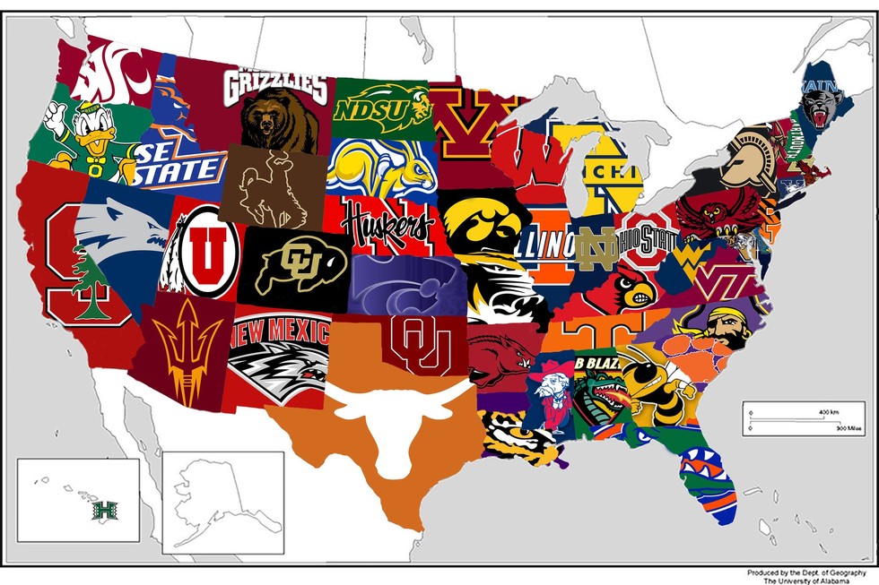
So there's this above, the most popular college football team in every state. Notice anything, Bulldog fans? Georgia Tech is the most popular in Georgia. Want even more? UAB is the most popular team in Alabama.

You're thinking, WTF?

Here's an explanation, from the story linked above in the first graf:
Fans voted through Google Forms, casting their vote for one of the state's teams. For example, 459 readers voted in the state of Alabama poll, with 249 picking UAB as their "favorite" team and 110 voting Alabama as their "favorite" team. Auburn received 71 votes and 29 people picked Other, a group that could include South Alabama or FCS team Jacksonville State.
This is a SLOP, a self-selected opinion poll, also known in the public opinion business as complete bullshit. Fun, yes. Interesting, maybe. But never ever to be taken seriously. Given this is about football, it's okay as nothing from this poll really matters except, maybe, hurting the feelings of certain fans. Maybe Georgia Tech fans know how to use Google Forms and UGA fans don't. Maybe a bunch of UAB fans organized and swamped the poll to knock out the Tide and War Eagle/Tiger/Plainsmen. Who knows, and it really doesn't matter of course.

You can see the stats here, via the Reddit page.


Rankings and AAU

I've written before, wondering aloud as to UGA's chances of ever being invited to the Association of American Universities, the big-kid club of research universities. I speculated in previous posts about whether UGA produces enough research -- and research dollars -- given it doesn't have a medical school. It takes big bucks to be asked to the academic prom. Today I approach this from a slightly different angle, comparing AAU membership to the world university rankings that came out this week.

Let's take a look.

The table below orders all the AAU members by their world rankings. Skim it. UGA would be in the bottom of the pile (I put it in the place where it'd sit, via rankings), but it's still better than seven other AAU members. What does this prove? Not much. AAU and the world rankings do rely on some of the same measures, so if you're pulling for UGA to get invited there's a little something here for you, but keep in mind the schools UGA beats in the world rankings (but are members of AAU) have been in for a long time. Missouri, for example, joined in 1908, Kansas in 1909, and the most recent being Buffalo in 1989.

Check on the list below with their respective world rankings. I have a little speculation at the bottom of the list.


SCHOOL World Rank
Harvard University 1
Stanford University 2
Massachusetts Institute of Technology 3
Columbia University 6
University of California, Berkeley 7
The University of Chicago 8
Princeton University 9
Yale University 10
California Institute of Technology 11
Cornell University 12
University of Pennsylvania 14
University of California, Los Angeles 15
Johns Hopkins University 16
University of California, San Diego 17
University of Michigan 19
Northwestern University 21
New York University 22
University of Wisconsin–Madison 25
University of Washington 27
Duke University 29
University of Toronto 30
The University of Texas at Austin 32
University of Illinois at Urbana–Champaign 34
University of North Carolina at Chapel Hill 38
University of Virginia 40
McGill University 42
Rutgers University–New Brunswick 43
University of Southern California 44
University of Minnesota 45
Ohio State University 46
University of Pittsburgh 47
University of California, Davis 49
Washington University in St. Louis 51
The Pennsylvania State University 52
Purdue University 56
University of California, Santa Barbara 58
University of Florida 59
Boston University 62
University of Colorado Boulder 65
Carnegie Mellon University 67
University of Maryland, College Park 68
Vanderbilt University 71
University of Rochester 72
The University of Arizona 73
Emory University 79
Georgia Institute of Technology 86
Brown University 87
University of California, Irvine 88
Texas A&M University 98
Michigan State University 106
Case Western Reserve University 108
Rice University 114
Indiana University Bloomington 123
The University of Iowa 125
Stony Brook University 154
UNIVERSITY OF GEORGIA 204
Iowa State University 205
The University of Kansas 206
University of Missouri 209
Brandeis University 229
State University of New York at Buffalo 272
Tulane University 288
University of Oregon 342

Who ranks high but isn't a member? Good question, because I'd assume those schools would be competing for an invite with UGA.

Dartmouth isn't a member. Surprised me, but it's ranked #50 in the world. The University of Utah is ranked #66 but isn't a member. Those are far above UGA's #204 ranking, and there are several other schools who aren't in the club but rank higher.

My take? UGA is several years away from an invite despite it's #17 Forbes best public school ranking (also out this week). Medical and engineering programs generate lots and lots of research grant dollars, and UGA's small programs in each are nowhere close to that kind of success and prestige.


States and UGA

I'm updating data for a talk later this summer, so I worked up a quick-and-dirty analysis of where UGA gets its undergraduates. The map below provides a glimpse, with darker states sending more students in Fall 2015 as compared to Fall 2000, and lighter states sending fewer students. Click on any state to get more info, but I'll provide some details below. It's a Google map, so you can move it around to see the whole country if you so choose. These data reflect only full-time undergrads.


Georgia is dark because, obviously, it's the University of Georgia. In 2015, as compared to 2000, there were 3,459 more students from Georgia at UGA. What's fascinating is both what states increased and what states decreased.

Increased

Texas (135 more students, a 126.2 percent increase)
Maryland (125 more students, a 290.7 percent increase)
North Carolina (97 more students, a 59.5 percent increase)
New Jersey (70 more students, a 170.7 percent increase)
Virginia (59 more students, a 50.4 percent increase)

Decreased

All the border states to Georgia showed negative comparing 2000 to 2015.

South Carolina (143 fewer students, -54.6 percent)
Alabama (97 fewer students, -61.8 percent)
Louisiana (86 fewer students, -55.1 percent)
Tennessee (67 fewer students, -29.9 percent)
Kentucky (18 fewer students, -43.9 percent)

Admissions folks would be better able to explain these trends. Perhaps the state schools in Texas and other places have become harder to get into, making UGA an attractive option. Perhaps UGA's rising academic reputation (#17 public university) is drawing better students from out of state and that means weaker, nearby state students are less able to compete. Or maybe state schools in South Carolina, etc., are doing a better job of keeping their own students. It's probably a mix of these and lots of other issues.


Monday, July 11, 2016

UGA Rankings

UGA was all aglow over being #17 in the latest Forbes "public universities" list. Note how the UGA press release fails to mention our overall ranking, which is #95 if you don't want to wade through the data. I do the work for you. That puts us just below Sewanee--The University of the South, and just above Trinity University of Texas.

But ... here are some fresher rankings, the World University Rankings. This is the serious stuff. So how does UGA do? We're #83 nationally, #204 in the world.

I'm guessing we won't see the UGA flacks pushing this one out. #17 public university sounds so very much better.

What hurts UGA's world ranking is "broad impact" (#263) but it's helped by patents (#94). Quality of faculty is #172, which is better than the #204 ranking. So that's something, I suppose.


Tribal Media Habits

Are people becoming more tribal in their news media consumption?

We've always known about the partisan migration of conservatives to Fox News and to a lesser extent liberals to MSNBC, but this recent Gallup poll finds people are more likely than previously to name a specific news source (like CNN) rather than a generic one (television news). That's a different measure than viewing.

(Thanks to colleague Michael Castengera for pointing this survey out to me)

The change is not dramatic, especially if keep in mind the margins of error in the poll from 2013 and this year, and yet there's something going on. From the link above:
"Television news" and "internet/computer/online" are still the most popular answers when Americans are asked to name their "main source of news about current events in the U.S. and around the world." But they are slightly less likely to name each one than they were in 2013. Meanwhile, numerous individual media organizations such as Fox News, NPR and various internet sites saw small gains that were not statistically significant on an individual basis but showed a major increase when combined into total mentions of specific media organizations.
If you go here you can see the full numbers or check out the table I've cut and pasted below. As you can see, generic television decreased 4 percentage points and generic online two percentage points. Fox inched up, as did CNN, and the biggest increase is a mashup of social media (again, only 4 percentage points, keep in mind the margin of error here). In all, the generics eased down a bit ("local TV news" or "news/evening news," the specifics tended to ease up (MSNBC, NPR, etc.).

Is this worthy of a headline? Probably not as much as you'd think, given the small changes and margins of error of the two surveys, but a definite trend seems to be developing. In journalism, all we need are two data points to declare something "a trend," so yeah, it's not a thing I'd considered before, the "naming" of a source as specific or generic, but it probably says a lot about the growing tribal nature of our partisan politics and, increasingly, tribal news consumption habits.