Thursday, July 14, 2016

It's Pettit, Dammit

We've lived in our Athens, Georgia, neighborhood for 25 years, and for 25 years we've driven down Pettit Lane to get to our street -- Greenbrier Way.

And as much as I love Google Maps, they've always had it wrong. The black circle on the Google Map below is our house, but note the spelling of the cross street. Pettits.


But if you go to the "street view" you see this below. Even Google can't agree with itself. I've reported this a few times over the years, but I dunno that anyone at Google actually reads the reports.


Tuesday, July 12, 2016

Of SLOPs, Bad Polls, and Football


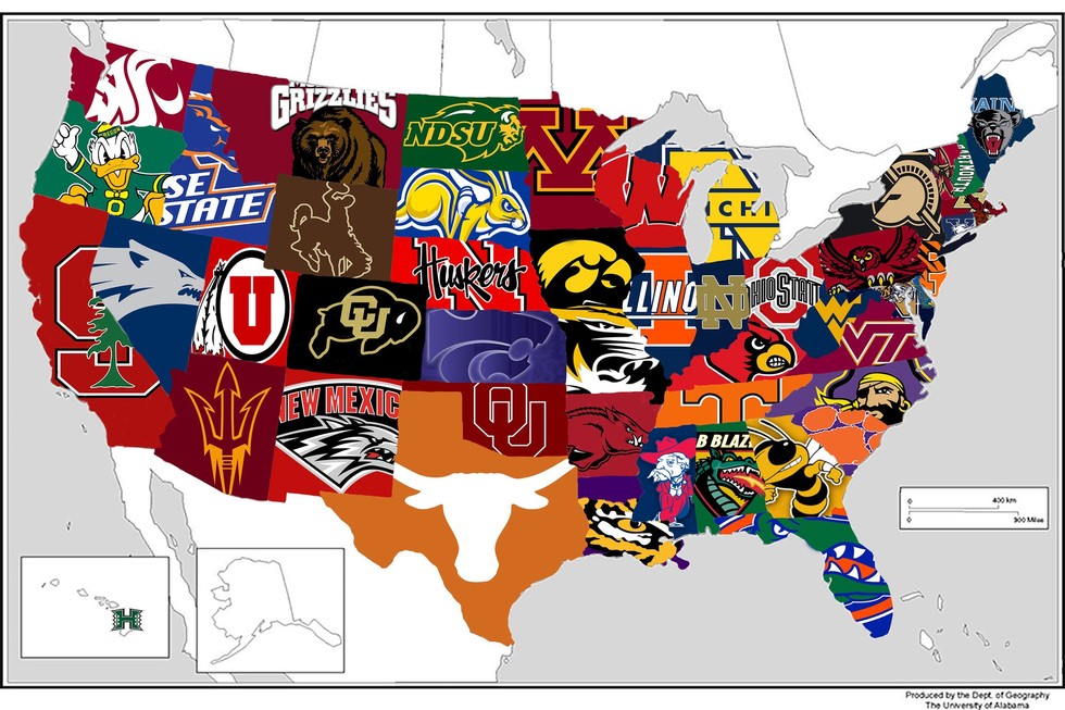
So there's this above, the most popular college football team in every state. Notice anything, Bulldog fans? Georgia Tech is the most popular in Georgia. Want even more? UAB is the most popular team in Alabama.

You're thinking, WTF?

Here's an explanation, from the story linked above in the first graf:
Fans voted through Google Forms, casting their vote for one of the state's teams. For example, 459 readers voted in the state of Alabama poll, with 249 picking UAB as their "favorite" team and 110 voting Alabama as their "favorite" team. Auburn received 71 votes and 29 people picked Other, a group that could include South Alabama or FCS team Jacksonville State.
This is a SLOP, a self-selected opinion poll, also known in the public opinion business as complete bullshit. Fun, yes. Interesting, maybe. But never ever to be taken seriously. Given this is about football, it's okay as nothing from this poll really matters except, maybe, hurting the feelings of certain fans. Maybe Georgia Tech fans know how to use Google Forms and UGA fans don't. Maybe a bunch of UAB fans organized and swamped the poll to knock out the Tide and War Eagle/Tiger/Plainsmen. Who knows, and it really doesn't matter of course.

You can see the stats here, via the Reddit page.


Rankings and AAU

I've written before, wondering aloud as to UGA's chances of ever being invited to the Association of American Universities, the big-kid club of research universities. I speculated in previous posts about whether UGA produces enough research -- and research dollars -- given it doesn't have a medical school. It takes big bucks to be asked to the academic prom. Today I approach this from a slightly different angle, comparing AAU membership to the world university rankings that came out this week.

Let's take a look.

The table below orders all the AAU members by their world rankings. Skim it. UGA would be in the bottom of the pile (I put it in the place where it'd sit, via rankings), but it's still better than seven other AAU members. What does this prove? Not much. AAU and the world rankings do rely on some of the same measures, so if you're pulling for UGA to get invited there's a little something here for you, but keep in mind the schools UGA beats in the world rankings (but are members of AAU) have been in for a long time. Missouri, for example, joined in 1908, Kansas in 1909, and the most recent being Buffalo in 1989.

Check on the list below with their respective world rankings. I have a little speculation at the bottom of the list.


SCHOOL World Rank
Harvard University 1
Stanford University 2
Massachusetts Institute of Technology 3
Columbia University 6
University of California, Berkeley 7
The University of Chicago 8
Princeton University 9
Yale University 10
California Institute of Technology 11
Cornell University 12
University of Pennsylvania 14
University of California, Los Angeles 15
Johns Hopkins University 16
University of California, San Diego 17
University of Michigan 19
Northwestern University 21
New York University 22
University of Wisconsin–Madison 25
University of Washington 27
Duke University 29
University of Toronto 30
The University of Texas at Austin 32
University of Illinois at Urbana–Champaign 34
University of North Carolina at Chapel Hill 38
University of Virginia 40
McGill University 42
Rutgers University–New Brunswick 43
University of Southern California 44
University of Minnesota 45
Ohio State University 46
University of Pittsburgh 47
University of California, Davis 49
Washington University in St. Louis 51
The Pennsylvania State University 52
Purdue University 56
University of California, Santa Barbara 58
University of Florida 59
Boston University 62
University of Colorado Boulder 65
Carnegie Mellon University 67
University of Maryland, College Park 68
Vanderbilt University 71
University of Rochester 72
The University of Arizona 73
Emory University 79
Georgia Institute of Technology 86
Brown University 87
University of California, Irvine 88
Texas A&M University 98
Michigan State University 106
Case Western Reserve University 108
Rice University 114
Indiana University Bloomington 123
The University of Iowa 125
Stony Brook University 154
UNIVERSITY OF GEORGIA 204
Iowa State University 205
The University of Kansas 206
University of Missouri 209
Brandeis University 229
State University of New York at Buffalo 272
Tulane University 288
University of Oregon 342

Who ranks high but isn't a member? Good question, because I'd assume those schools would be competing for an invite with UGA.

Dartmouth isn't a member. Surprised me, but it's ranked #50 in the world. The University of Utah is ranked #66 but isn't a member. Those are far above UGA's #204 ranking, and there are several other schools who aren't in the club but rank higher.

My take? UGA is several years away from an invite despite it's #17 Forbes best public school ranking (also out this week). Medical and engineering programs generate lots and lots of research grant dollars, and UGA's small programs in each are nowhere close to that kind of success and prestige.


States and UGA

I'm updating data for a talk later this summer, so I worked up a quick-and-dirty analysis of where UGA gets its undergraduates. The map below provides a glimpse, with darker states sending more students in Fall 2015 as compared to Fall 2000, and lighter states sending fewer students. Click on any state to get more info, but I'll provide some details below. It's a Google map, so you can move it around to see the whole country if you so choose. These data reflect only full-time undergrads.


Georgia is dark because, obviously, it's the University of Georgia. In 2015, as compared to 2000, there were 3,459 more students from Georgia at UGA. What's fascinating is both what states increased and what states decreased.

Increased

Texas (135 more students, a 126.2 percent increase)
Maryland (125 more students, a 290.7 percent increase)
North Carolina (97 more students, a 59.5 percent increase)
New Jersey (70 more students, a 170.7 percent increase)
Virginia (59 more students, a 50.4 percent increase)

Decreased

All the border states to Georgia showed negative comparing 2000 to 2015.

South Carolina (143 fewer students, -54.6 percent)
Alabama (97 fewer students, -61.8 percent)
Louisiana (86 fewer students, -55.1 percent)
Tennessee (67 fewer students, -29.9 percent)
Kentucky (18 fewer students, -43.9 percent)

Admissions folks would be better able to explain these trends. Perhaps the state schools in Texas and other places have become harder to get into, making UGA an attractive option. Perhaps UGA's rising academic reputation (#17 public university) is drawing better students from out of state and that means weaker, nearby state students are less able to compete. Or maybe state schools in South Carolina, etc., are doing a better job of keeping their own students. It's probably a mix of these and lots of other issues.


Monday, July 11, 2016

UGA Rankings

UGA was all aglow over being #17 in the latest Forbes "public universities" list. Note how the UGA press release fails to mention our overall ranking, which is #95 if you don't want to wade through the data. I do the work for you. That puts us just below Sewanee--The University of the South, and just above Trinity University of Texas.

But ... here are some fresher rankings, the World University Rankings. This is the serious stuff. So how does UGA do? We're #83 nationally, #204 in the world.

I'm guessing we won't see the UGA flacks pushing this one out. #17 public university sounds so very much better.

What hurts UGA's world ranking is "broad impact" (#263) but it's helped by patents (#94). Quality of faculty is #172, which is better than the #204 ranking. So that's something, I suppose.


Tribal Media Habits

Are people becoming more tribal in their news media consumption?

We've always known about the partisan migration of conservatives to Fox News and to a lesser extent liberals to MSNBC, but this recent Gallup poll finds people are more likely than previously to name a specific news source (like CNN) rather than a generic one (television news). That's a different measure than viewing.

(Thanks to colleague Michael Castengera for pointing this survey out to me)

The change is not dramatic, especially if keep in mind the margins of error in the poll from 2013 and this year, and yet there's something going on. From the link above:
"Television news" and "internet/computer/online" are still the most popular answers when Americans are asked to name their "main source of news about current events in the U.S. and around the world." But they are slightly less likely to name each one than they were in 2013. Meanwhile, numerous individual media organizations such as Fox News, NPR and various internet sites saw small gains that were not statistically significant on an individual basis but showed a major increase when combined into total mentions of specific media organizations.
If you go here you can see the full numbers or check out the table I've cut and pasted below. As you can see, generic television decreased 4 percentage points and generic online two percentage points. Fox inched up, as did CNN, and the biggest increase is a mashup of social media (again, only 4 percentage points, keep in mind the margin of error here). In all, the generics eased down a bit ("local TV news" or "news/evening news," the specifics tended to ease up (MSNBC, NPR, etc.).

Is this worthy of a headline? Probably not as much as you'd think, given the small changes and margins of error of the two surveys, but a definite trend seems to be developing. In journalism, all we need are two data points to declare something "a trend," so yeah, it's not a thing I'd considered before, the "naming" of a source as specific or generic, but it probably says a lot about the growing tribal nature of our partisan politics and, increasingly, tribal news consumption habits.

Tribal Media Habits

Are people becoming more tribal in their news media consumption?

We've always known about the partisan and ideological migration of conservatives to Fox News, and to a lesser extent liberals to MSNBC, but this recent Gallup poll finds people are more likely than previously to name a specific news source (like CNN) rather than a generic one (television news).

Thanks to colleague Michael Castengera for pointing this survey out to me.

The change is not dramatic, especially if keep in mind the margins of error in the poll from 2013 and this year, and yet there's something going on. From the link above:
"Television news" and "internet/computer/online" are still the most popular answers when Americans are asked to name their "main source of news about current events in the U.S. and around the world." But they are slightly less likely to name each one than they were in 2013. Meanwhile, numerous individual media organizations such as Fox News, NPR and various internet sites saw small gains that were not statistically significant on an individual basis but showed a major increase when combined into total mentions of specific media organizations.
If you go here you can see the full numbers or check out the table I've cut and pasted below. As you can see, generic television decreased 4 percentage points and generic online two percentage points. Fox inched up, as did CNN, and the biggest increase is a mashup of social media (again, only 4 percentage points, keep in mind the margin of error here).


Is this worthy of a headline? Probably not as much as you'd think, given the small changes and margins of error of the two surveys, but a definite trend seems to be developing. In journalism, all we need are two data points to declare something "a trend," so yeah, it's not a thing I'd considered before, the "naming" of a source as specific or generic, but it probably says a lot about the growing tribal nature of our partisan politics and, increasingly, tribal news consumption habits.